Labels

Tuesday 18 October 2011

Brand Identity

Digipack Ideas
Both myself and Charlotte came up with a creative idea to use for our digipack which would involve us developing our skills in photoshop. We want to take one amazing photo of the location that we are going to film in (which would be London.) We then wanted to edit this photo so that it really stood out and had connotations of our genre. We then came up with the idea that maybe we could take a series of images of Nathan (who is going to be our lead male) and display them like a mini photo shoot. We would like to edit our mini series of photo's so that the vibrant colours reflect our pop/indie genre. 
Lastly, we came up with the idea to print our series of images onto elletrocet, so that when we overlap these images onto our location photo our pictures of our lead male will look as though they are faded, as if he is being consumed by London like in the narrative of our song.


Here are some similar digipack covers that me and Charlotte found when planning our idea's. What we also need to include into our digipack is the title of our artist and the name of our song. We especially liked the idea of having the series of images and then the artists name in the centre, so that it really stands out and is therefore going to be the image that attracts them. However, when taking a second look they'll see the mini series of photo's and become intrigued. I think that this will be a clever approach to use for our digipack, however we are still discussing our different idea's.


I really enjoyed choosing our ideas for our font, as me and Charlotte both knew what image we wanted to portray, therefore we had considered the size, style and boldness etc. Above are the five selections that we were mostly interested in, with our chosen artists name. We decided on Frank because we wanted something simple for the first name, nothing to dramatic or extreme. This is because we want our audience to be able to relate to our artist, therefore by giving him a realistic name makes him more relatable.

Sunday 16 October 2011

Planning posts - checking your progress Oct 16th SJA

www:
  • The planning posts on 'Initial Ideas' and job roles show effort and some imaiginative use of ICT to present and communicate ideas.
  • The use of short iMovie to communicate your 'initial ideas' is really effective. I think you also did something similiar for your post on 'Image Annotation' - but there seems to be a copyright bar on this now - so you will have to come back and re-think how to present your ideas.
  • I thought your practice CD cover on photoshop looked really good - you selected an excellent photograph that seemed really suited to the idea of 'artist' and similiar representations in this genre. The font choice also worked really well with the simplicity of your image, as did the sepia effect. Nice work on this.

ebi:
  • I am quite concerned at how many posts are missing from 'Planning' so far Brittany? I thought you had been busy working on this??
  • You obviously need to come back to the post on 'Technical tutorials' - and upload your greeenscreen / final cut work to this.
  • Lyrics post has the lyrics, but nothing else?? You need to sit down with Charlotte and a print out of the lyrics and really thoroughly annotate every line to show your thoughts and ideas (where do you plan to shoot scenes? How will you communicate the narrative? Specific camera shots / ideas you want to incorporate?) Posts on 'Song Details', 'Lyrics' and 'Concept' all need more work.
  • Where is your photoshop work for the advert planning / ideas? This needs to be there. You also need to provide written explanation about your ideas / thinking behind the image of Jade you used for the CD cover design practice task. Please don't just upload an image without any explanation Charlotte.
Planning progress so far: IN (Improvement Needed) - you know you have work to catch up on Brittany. I know it will end up looking amazing, but try to stay on top of it to avoid putting yourself through all the grief of last minute rushing. To reach the top of Level 4 (which is what you are certainly aiming for) you really need to show creativity, innovation, imagination and ICT technical flair for every post. The 'Planning' section of your blog really should provide you with loads of opportunities to demonstrate all of these things.

Friday 14 October 2011

CD COVER DESIGN

Here I have used photoshop to create a draft CD cover of our artist Nathan Bedford against a plain background holding a hooded gesture. We have decided to get Nathan to do this position as it's quite enclosed and private which relates to the title, 'London calls me a stranger'. The character looks very lonely and unhappy due to his facial expression looking down at the floor revealing a loss of confidence in comparison to if he was smiling and making eye contact with the viewer. I have edited the picture into a black and white colour scheme to contradict the stereotype of London being colourful and exciting, because this characters lyrics reveal his segregation and separation he feels. 
I think that this is my most interesting CD cover design as there is a lot going on and looks similar to an illusion. However, I think that this is definitely the most eye grabbing out of the three. My favourite aspect of this CD cover is the cropped out eyes, with the overlapping of the text. I think that that is what makes the photo as success as it is. It adds an interesting element, as it emphasizes that in the pop industry your image is always important and that artists are forever trying to do something new or completely wacky to gain attention and publicity. One thing that I think we could improve on is that none of our colours used necessarily the correct connotations of what a stereotypical pop cd cover would look like. Pop CD covers generally have vibrant colours to convey the happy, upbeat tempo that is portrayed through their lyrics. However, this CD cover uses dull and dreary colours and doesn't have much life to it. I would say that overall this CD cover looks more techno than pop, however I enjoyed experimenting with the different editing and techniques on photoshop, using these skills that I've gained to help develop my idea's for my actual CD cover.
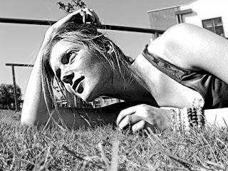
I think that this CD is successful as I think that it is a really well framed picture and is really captivating. The contrast between her skin colour and her eyes I think is capture really well as her eyes are more bold and therefore is a direct address to her target audience, as it seems as though she is looking at them. This was also another development of our photoshop skills as it took a while to figure out how to contrast the tones and colours in our picture, however I think that it has resulted in making our CD cover more successful. The background image also contrasts with the foreground image, as the foreground image is very bright and has a sort of smooth/soft texture. Whereas the background is dominated with dark, negative imagery and conveys a rough texture. One thing that we could improve on when we come to actually creating our CD cover is that even though everything worked well like the framing and the quality of the picture etc. I still think that this CD cover isn't an obvious pop genre, and I need to ensure that this attracts my target audience as this is the genre of music that they'll listen too.
Our last CD cover is definitely the most successful out of the three. This is because it has all of the connotations of what a pop CD cover would look like. Myself and Charlotte spent a duration of time researching a font that we think would gel really well with our CD cover, as we wanted our third attempt to be our best. I really like this font because it's simple but yet will still capture our audiences attention. Also, the font is slightly girly but not in an obvious way, and so therefore it will still attract both genders. I also like how subtle our background is, as in the previous two I think that it slightly distracted us from our main image in the foreground. The use of mise en scene has worked really well as the high key lighting and facial expression/body language really convey the emotion of what might be incorporated in a pop song, without being to dramatic or over the top. By also using a simple but effective background, it has allowed our font to be more prominent. Overall there is nothing that I would like to improve on for this CD cover, and this is definitely our most successful.

Monday 10 October 2011

Concept


For our concept I decided to create a mood board for all of our costumes and locations that we had decided on. I wanted my mood board to look creative to emphasize the creative approach that we wanted to bring to our music video. Our main focus for this is our locations, costumes and props. As I have mentioned before our music video has a very strong narrative and therefore all three of these elements are key. Therefore, myself and Charlotte spent a long duration of time deciding on a specific look that we wanted. As the majority of our music video is going to be filmed around London, then we wanted a 'typical' London look that most young girls/boys have. Both Topshop & Topman are extremely popular amongst our target audience, therefore we decided to research outfits that went with their look.

For our props we decided that we should keep it simple, so that we don't detract from the key elements of our music video. Therefore we are only thinking of using an acoustic guitar and possibly a bicycle. We choose to incorporate an acoustic guitar as many male pop artists such as Ed Sheeran, James Morrisson and Jason Mraz use these throughout their video's to convey a casual, relaxed mood. We also choose to use the bicycle as it's a typical stereotype for a young person to travel around London on either bus or bike. However, we thought that by using a bike it would make our music video more interesting and we'd be able to use a variety of shots.
A special effect that I am really keen and looking forward to using in our video is the fast motion effect. It was this particular shot from a video that inspired us to use a special effect like this for our own. The girl is a representation of loneliness, even though she is in a busy environment where everyone is getting on with their own lives, she feels as though she is stuck in the same place going nowhere. I think that that idea is reflected really well in this particular shot and that is why me and Charlotte have chosen to re-construct something similar in our own.

Final Assessment 'RESEARCH' Oct 10th SJA

www:

- Well done for going back through teacher feedback thoroughly and investing so much energy and time in getting your Research section completed to a really high standard Brittany.
- All posts are visual, with many of an 'excellent' standard of thought, creativity in presentation and revealing excellent subject knowledge. I really like the use of very short 'extracts' from music videos, and the use of gifs throughout.
- Your analytical posts are really interesting to read, as you clearly are thinking carefully about how artists working within different genres choose to represent themselves.
- Your analysis of the audience questionnaire was excellent, and I hope the findings will be of good use in your planning.

ebi (for Planning & Evaluation Sections now):

- Time management is always going to be a key issue as the next few months progress. You are going to be really busy - that is just part of it all Brittany I'm afraid. Time management is also one of the assessment criteria for your coursework - so please set aside your free periods to use the media rooms as much as you can to get the tasks done - to a consistantly high standard.
- Always think of ways (and be prepared to allow yourself time) to really come up with creative and unique ways to present each posts - make sure you use functions like the YouTube tagging feature, or a voice over commentary to talk through any analytical posts. Use JING to 'show' technical skill - this will boost your mark in this aspect of your blog.
- Be super organised in the Planning stages of your music video now - None of your work over the coming weeks can be thrown together - you will need to storyboard, plan effectively, try out lighting, etc, etc... Always document this and keep on top of blog posts.
- You need to clearly LABEL all of your posts under 'Research' and 'Planning'

Overall mark for RESEARCH section: Level 4... there is really some excellent work here, please make sure this continues, with no inconsistency in the quality of your posts.
The 'Planning' section should give you the opportunity to really show off what you can do in terms of presentation, use of ICT, and clever, creative communication of your thoughts and ideas.

Tuesday 4 October 2011

Image Annotation

The image of my groups artist is influenced by the artist of the song that we have chosen who is 'Ed Sheeran.' We chose to base our artist around Ed Sheeran as he has such a unique way of performing and a real eye for pulling at peoples heart strings when he creates his music video's. All of his video's have a powerful narrative, and that is definitely something that we like to achieve when filming ours. However, in his video's he only appears for about 10 seconds, and we would like our singer to appear more frequently, taking on more of a main role.

When Ed Sheeran performs he's very artistic and creative, as whenever he performs he only ever has his guitar and loop pedal and never any backing singers or a band. This allows his performances to become quite intimate and extremely interesting as he is forever doing something. I think that this is very key when filming our music video as the intimate vibes are developed and portrayed through his music. He's always in baggy clothes and has scruffy hair which connotes how important his music is to him. I think that this is also key for our video as he's always seen as such an ordinary artist who worked his up from busking in the streets of London. This gave me and my group the idea of perhaps filming our music video in a location that is rife for tourism and perhaps having our lead male role busking. This connotes extremely well with our song called 'The City' which is all about someone moving to London for the first time and trying to make a name for themselves but struggling with their new life. Therefore I think that me and my group would represent our artists as being quite vulnerable and naive in comparison to the streets of London.
Ed Sheeran also is known for the colour orange and a pawr as his trademark, as they both represent his firey ginger hair.


However, the image annotation to our music video is vital, and we feel as though the one thing that Ed Sheeran lacks in is being a fashion icon. Male pop artists need to follow the stereotype as to what is being expected of them and dress relevant to their genre. Therefore me and Charlotte went away and viewed some pop music video's and made a short clip of their fashion sense and the personality that they bring to their performance.


Not only did these short clips from the pop music video's helped us to decide on our costume but also helped us to plan the body language, posture and facial expressions our artist will need to portray for our music video and for our CD cover photoshoot. One specific thing that I noticed was that in every video eye contact with the audience is vital, therefore me and Charlotte must ensure that our artist does this when lip syncing.

Me and Charlotte chose to base our lead males fashion image around Topman clothes. We chose Topman as it is currently very popular amongst boys both young and older. This means that it is affordable for the majority of our audience that we are trying to target, and therefore it's easier for our target audience to relate and aspire to be like our male role.

Lyrics Annotation


I really enjoyed annotating the lyrics to 'The City' as it really allowed me and Charlotte to process what we actually would want to do in our music video. Therefore by depicting each sentence from the lyrics we were able to really invest time into thinking about how we would take the narrative from the song and digitally create something fantastic. Moreover, as the song is written in a narrative it made it easier for me and Charlotte to visualize what we wanted to do, as we wanted to create a story through the eyes of the person singing this song. We also watched endless video's from male pop artists so that we could capture the idea and emotion that they were trying to evoke in their audience, as our target audience would be similar to theirs. This was a great success as shots and editing that we hadn't thought of using yet(like fast motion shots)were something that would work really well in our music video.
Another aspect that we also considered was Andrew Goodwin's theory. We knew that illustration was important and that our shots must always cut on the beat. As the narrative in our music video is key, we knew that we had to illustrate the literal meaning or feeling of the lyrics, and that when we did decide to use our lead male we would have to ensure that he conveyed the emotion relevant to the lyrics when he is lip syncing. Another reason as to why me and Charlotte decided to watch lots of other male, pop videos was that the roles in our music video's would have to be dressed as expected, and that we must convert to stereotyping so that we engage and intrigue our target audience as well as avoiding viewer fatigue.

Song details


www.
When it came to choosing the song for our music video we pretty much knew what kind of music we wanted to do so it didn't take us long to decide. Both myself and Charlotte really like Ed Sheeran, and as he is still relatively new we knew that there would be a lot of songs from his upcoming album that wouldn't have a video that we could use. So me and Charlotte spent an hour or so going through all of his songs and deciding which one we most liked the sound of and ended up choosing 'The City.'
ebi
Even though me and Charlotte are completely happy with our choice of music, I guess we still could have invested a little more time looking at other artists instead of immediately choosing to do Ed Sheeran. Perhaps we could have even looked into the different genre's instead of just immediately deciding to do pop. However, we knew pretty much instantly that we would be most successful at picking the song 'The City' as we said in our video we had great idea's of shots and idea's for the narrative of the song.

Technical Tutorials


I thoroughly enjoyed mine and Charlotte's technical turorial session as it gave us a chance to practice using the green screen and helped us with our confidence when performing in front of the camera. There wasn't any pressure to perform we just had fun and done the best that we could. As we might be using instruments in our music video, it was really helpful practicing with them in our performance as neither of us has ever played an instrument so we were able to get some tips from other members of our media class who do. My having our session with the green screen I realised that I wasn't as confident in front of the camera as I initially thought, therefore Charlotte chose to take the lead role in lip syncing our chosen song which was 'Glad You Came' by a pop band called The Wanted. I'm glad that we chose a pop song as our song for our music video is pop, therefore we had to convey similar emotions and energies.
This is an image of me and Charlotte filming other groups using the green screen. For each group we used three people to film at the same time as then you were able to capture the group from all different angles. This is a clever idea as having many different angles of the shots avoids viewer fatigue, and will allow our music video to be more successful. I enjoyed being behind the camera as I got to experience what would look good from the directors point of view, as I will be filming Charlotte for the majority of our music video. We also might be using the green screen for our actual music video, therefore me and Charlotte benefitted from this as we had never really used the green screen before and so this gave us some good practice and a heads up.

Overall, I found our green screen session very successful as both me and Charlotte benefitted from it. Because we were slightly embaressed about our class watching us, I don't think neither of us performed to our best ability. However we tried our best and it was a success. 
Below is our final edited version of our practice green screen that we edited in final cut. Although we struggled with final cut and things kept going wrong for us, we were persistent and worked hard to finish it.


Here is a video from our session in technical tutorials. I think that the video is quite good but I think that there is a lot of room for improvement. I'm pleased with the selection of our song, as it fits perfectly with our genre and the image that we were trying to portray. Charlotte already knew the lyrics to all of the song, so that was also helpful. However, there was a couple of times when she slipped up, but this was only a practice and we know now that for the real thing that she needs to learn her lyrics off by heart. I think confidence effected our performance to an extent, as I particularly was a lot more shy in front of the camera than I thought I would be. That is why we decided that I should direct, as Charlotte is a dancer and therefore is confident and has a lot more experience in performing. Overall I would say that keeping in time was our biggest issue, as when Jack comes in on the drums he is also slightly out of time. Moreover, I think that both myself and Charlotte could be a lot more enthusiastic in our performance, as the artists of the song are pop musicians and in a pop performance there should always be a lot of energy and enthusiasm to connote to the genre and lyrics in the song.
Overall, I am pleased that we did this practice technical tutorial in class as even though it wasn't that successful I think that watching ourselves back we knew exactly where we went wrong and area's to improve on. I also enjoyed it, as we got to experience being behind the camera as well in front of it. As we are keen to use green screen in our music video, it was useful to help prepare and set it up. I have  little experience with the green screen and Charlotte doesn't have much either, so instead of rushing into it without really knowing what we were doing, it was useful to practice when we had our teachers support and assistance.

Roles

Our lead male (Nathan)


We decided to use a male character to lip sync our song, as of course a male sings the song. We asked our friend Nathan if he would be the lead role as Nathan is extremely comfortable and confident infront of the camera, and we also used him because he is extremely reliable and we knew that we could trust him to turn up to our filming. He also fits the criteria of what we would like our lead role to look like, as he has quite an edgy and indie look about him. Another key element that we know Nathan will provide is as that as he is comfortable infront of the camera so he won't struggle making eye contact with the camera, allowing him to really connect and maintain a good relationship with our audience. Because our song that we have chosen is extremely narrative we really need to convey the emotion that the lyrics in the song are trying to convey. I have also watched a few of Nathan's previous lip sync tasks, and I know that he's immensely good at lip syncing, which is also key for our music video. Overall, me and Charlotte both agreed that he would be perfect for our role and hopefully it will be a success.

Ed Sheeran
Ed Sheeran is the artist that we would like Nathan to base his role on from his performance. Here are a few clips of Ed Sheeran performing, and we would like Nathan to focus on his body language, posture and how he presents and the feelings that he conveys when he performs. Here is a few clips of his performances from live shows that I've put together:

Our lead female role (Charlotte)

As well as having a lead male role to lip sync in our music video, we decided that we would like to use a lead female to represent our narrative. We have discussed a few idea's where we might use a lot of over the shoulder shots and long shots so that she is shown amongst the hectic, heavy London lifestyle lead by people. This will hopefully be used as a representation of the lonely connotations in the lyrics. However we will also be using lots of close ups and establishing shots to capture the mood and emotion that Charlotte will portray as her character in our music video. Charlotte also takes Dance at A-Level and is an extremely good dancer. Therefore she is use to conveying her emotion through movement and body language etc, which will be really useful as our narrative and our characters performance I think play a vital role in our music video. Although we don't have a character that we are basing Charlotte on, here are a few clips from other music video's that I've created:


Director of our music video (Me)

Lastly, my role in our music video is to direct and film. Even though Charlotte will be helping to film Nathan's lip syncing shots, I will be filming for the majority of the shots that we film around London. We decided that this role would most suit me because I study Photography at A-Level, and therefore I've had a lot of experience and practice at framing shots and using the rule of thirds. This is because me and Charlotte want to ensure that every one of our framed shots are like a photograph so that this allows our music video to reflect our full potential. I also really enjoy being behind the camera, and seeing what looks best through a lens. Moreover, I'm not very confident in front of the camera and therefore my performance wouldn't be very good in comparison to what Charlotte would be able to bring. Once we have completed our filming both Charlotte and I will be editing our music video, editing in effects and transitions to allow our music video to be of a higher quality and to avoid viewer fatigue.


Initial Ideas


The song that both I and Charlotte choose for our music video tells a very interesting, powerful narrative that is based around London. Therefore it was very easy for us to construct our idea's and really get involved in planning what we wanted to do to make our music video successful. We decided that we would like most of our location shot around central London, just because it sets the atmosphere and is relevant to our song. We also decided that we'd like to film some parts around Camden high street, as I think that it's a very interesting place that many people don't so often get to see. We definitely want to use a lead male for our role of the singer, although we would like to feature a female in our roles (which will be Charlotte herself) to add to the narrative of the song. We would like to add instruments into our music video (preferably an acoustic guitar) as the music video is about someone moving to London for the first time, and as the realization kicks in they feel quite alone in this busy, hectic lifestyle.
Therefore we thought that the idea of someone 'busking' in the streets of London to be appropriate. When I helped out at summer school during the summer holidays we helped people in the younger years film their music video. One group overlapped their singer miming onto other images that they had filmed. I discussed this idea with Charlotte as I thought that it would really fit well with the connotations that we were trying to convey in our music video. Also, one of our main influences is an artist called Ed Sheeran, who has inspired many aspects of our initial idea's. In his music video 'The A-team' (you'll see the clip that we have added in our video above) he uses fast motion editing to convey and emphasise the loneliness that his character felt. Although for very different reasons, we thought this was a fantastic way to reveal our character as lonely, and as neither me or Charlotte have ever tried fast motion editing before this would also help us to improve our editing skills and to hopefully progress our video into something more impressive.
Moreover, I think that me and Charlotte both had very similar idea's when it came to what we wanted to do, and therefore we made it very easy for ourselves when planning our initial idea's.
Here is a close up of our idea's if you couldn't quite read them in our video:

What makes a good publicity photo?


I had to choose different music genre's and create photo's that would represent a particular genre. The genre's that I choose to represent were Hip-Hop, Pop and Rock. I choose these genres as I thought that these would be the easiest to represent. For HipHop I took photo's of two male characters, using jumpers, hoodies and bling as props as this connotes the intimidation and wealth that most rappers present us with in their publicity photo's. The facial expressions used in hip-hop publicity photo's are quite agressive, as they often rap about their anger and troublesome lifestyles. The 'bling' that they are seen wearing contrasts with their clothes as it represents how far that they've come and now they're successful and powerful in many different aspects than what they were when they were on 'the streets.' They are often seen showing gang signs which represent their hometown or their previous gang life that they have now overcome. This is why for one of my pictures you see someone pointing their gun fingers directly into the camera. However, this is just a stereotype used by rappers and therefore this isn't always the case.
My second genre that I choose was Rock. This is another easy stereotype as rock music is also presented as the artists being quite rebellious and violent, given one of the reasons why I've shown someone about to kick a sign over. Something that I represented a bit differently was that rock music is stereoptypically dominated by males, and here in my video I've shown females. I think that facial expressions are also key when representing rock artists as they're always perceived to be angry and are never shown looking remotely happy. You'll often find that the lead singer will always dominate the picture, and will either be the only one in focus in the picture or the photo will be framed so that the lead singer is directly in the foreground of the photo.
Lastly, my third genre that I choose to do was pop. I found pop to be the easiest publicity photo as I think that it is fair to say that pop concentrate more on the image of the artist than the actual music that they produce. Vibrant colours are often used to convey the upbeat song, however it is very unlikely than any instruments are ever used in pop and that's why I have not chosen to include any. Stereotypically you will find that either close up or mid shots are used for pop artists. Close ups are used to emphasise the beauty of the artist, or mid shots are used to emphasise the sexual image that is trying to be portrayed by the artist, as pop artists like Rihanna or Katy Perry are often seen in skimpy outfits in their publicity photo's.
However, if there is a pop band you will find that the most attractive member of that group will be in the centre of the photo. For example, here is a publicity photo of the pop band 'The Saturdays.'

In the centre of the frame is band member Frankie Sanford. Even though it would be fair to say that she is the weakest member of the band, and she barely has any solo's in any of her groups songs she still remains the main focus. This is because popularity wise she is the most successful because of her beauty, and therefore is centred directly in the middle of the frame so this publicity shot grabs attention more quickly than it might do if it were another member of the band.


I have chosen to edit a few images from my own publicity photo's as all genre's go into post production before being released to the public. This is so that their images can be edited or exaggerated to connote with their genre or appeal more so to their target audience. Here I have edited two photo's from my 'pop' genre. As I previously mentioned pop music focuses more so on their image rather than their music, and therefore they couldn't put a photo of an artist not looking their best as it wouldn't attract as much attention than if it was edited. That is why most photo's are airbrushed so artists are perceived as being 'perfect' and therefore fans would then aspire to be like them and hence why they'd make more publicity.

Monday 3 October 2011

Assessment 'RESEARCH' SJA 03/10/11

www:
  • Brittany, parts of your blog are a real joy to read - it's obvious that you are thinking carefully about conventions of Pop and Rock videos and there's signs that you are really trying to push the blog to its full potential for some posts
  • Good use of gif's for a few posts - and good use of contact sheets.
  • Some very insightful analysis for some posts where you have been asked to analyse adverts and album covers
  • You have so much potential in Media, but I do feel as though this blog does not reflect the levels you were achieving in Year 12 at this stage Brittany, still quite a bit of work to complete for the 'Research Section'
ebi:
  • Post 1 - Brief - is very... brief!!? Perhaps a little more detail would show what an A Grade student can do...
  • Post 8 - Conventions of a music video - still no visuals - push the blog to be really visual and exciting to read / look at - this is the perfect post to show your ICT skills and to make really creative
  • Post 9 - Theories - Bordwell - Missing?
  • Post 11 - Theories - Goodwin - missing?
  • Post 13 - Mood Board - needs a paragraph to explain why / how artists working within this genre want to be represented (remember you have a high target grade.... work for it...)
  • Post 14 - Really good post for 'Bad Day' - good to see gifs included, the other two posts you have contain good contact sheets - could you be more creative? Still 2 posts missing for this??
  • Post 15 - Genre conventions - good to see moving gifs - but really very brief and vague comments that don't really show a sophisticated understanding of the genre conventions at all - I hope you want to show an examiner that you can obviously do better than this and display wider knowledge here...
  • Post 16 - CD cover analysis - only one (a very good one for 'Local Natives'...) but 2 missing?
  • Post 17 - Record label research - Needs one more? The two entries you have for this are very good.
  • Post 18 - Advert research - only one there? Needs 3?
  • Post 19 - Audience Survey - needs to be posted / scanned in
  • Post 20 - good graphs, but you will need to analyse to show / explain how you intend to use these results in your music video ideas
Overall assessment: IN (IMPROVEMENT NEEDED) - Referral for underachievement. Brittany, it's disappointing to see so many gaps missing in your blog this time. You need to prioritise getting this totally sorted out this week and making sure every post is 100% complete and every post is striving towards an 'A' grade - be creative, clever, and visual in your posts. There's too much work missing.

You have until Friday Oct 7th to get this completed before the absolute final mark. Do not let yourself down with work that is currently less impressive than what you did in Year 12.